picPixie
A photo editing, mobile app
It all began with two guys and an algorithm.
The Overview
Why
One of the founders of picPixie has a friend that struggles with anxiety.
With the COVID pandemic, and all the changes in life that came with it, his friend was experiencing debilitating anxiety symptoms. He wanted to help.
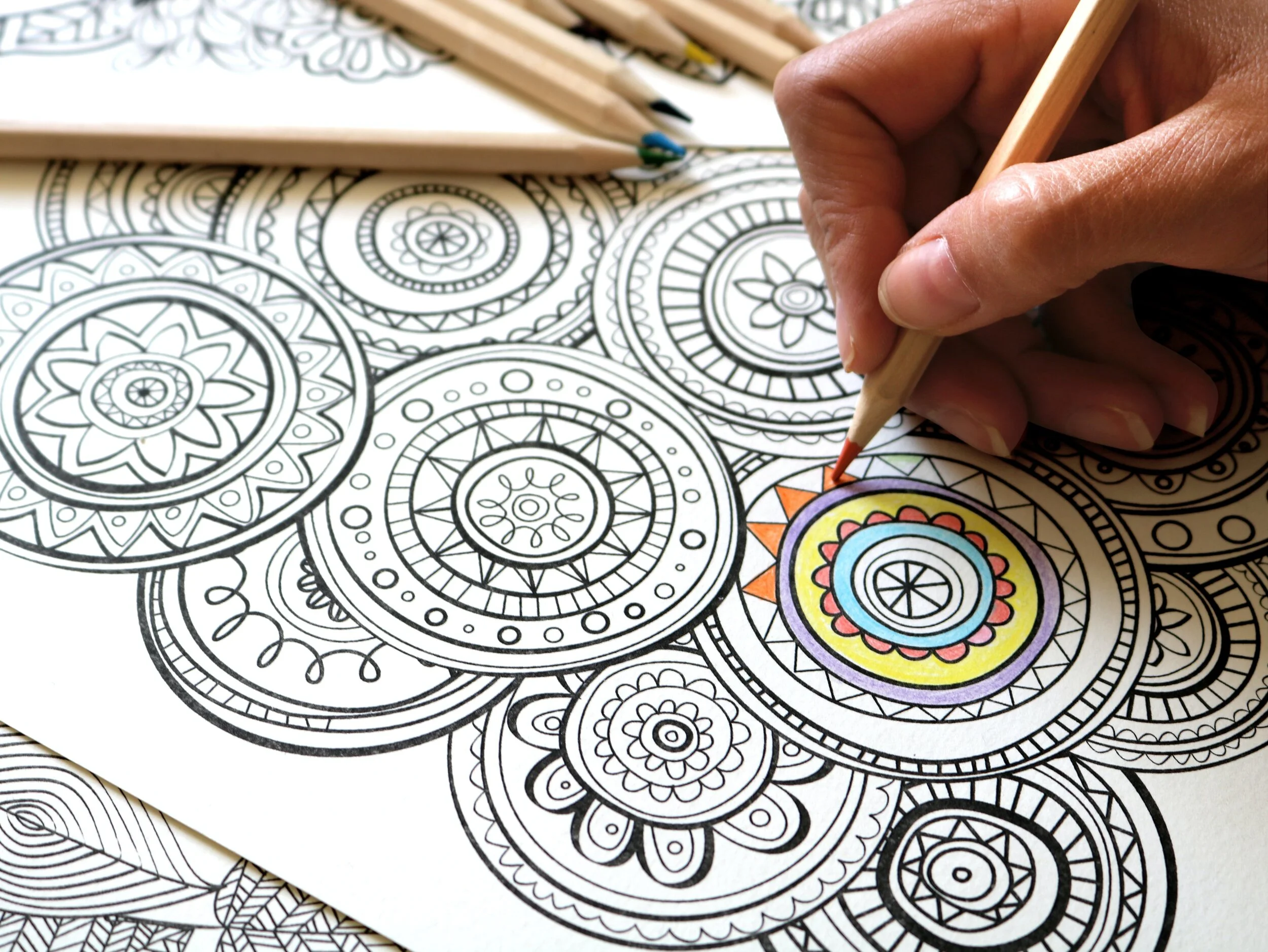
He remembered his friend had mentioned using coloring pages as a therapeutic tool. What if there was a way to make their coloring pages more personal by transforming a photo into a black-and-white coloring page? One night, he stayed up and successfully created an algorithm to do just that.
The UX Team
Research Lead: Kristin White
Design Lead: Marty Smith
Design Co-Lead: Prezetta McCall
Producer: Hannah Rosebraugh
3-week sprint, June 2020
The Challenge
The picPixie start-up company wanted us to design an application for their photo transformation algorithm. The stakeholders, Alex Krebs and Kevin Coyle, desired free access options but also wanted the design to allow for future profit.
Simplicity and keeping the inspiration from art therapy in mind was important to them.
At this point picPixie had no constraints. “The sky’s the limit” was the parting theme from the first meeting between my team and the stakeholders.
Tools
Figma
Trello
Zoom
Google Suite
Methods
Competitors’ Feature Analysis
Secondary Research
User Research Interviews
Online Survey
Affinity Mapping
Persona
Wireframe Sketching
4 levels of Prototypes
Usability Testing
Final Research Report
The Process
Defining the Market
PicPixie did not have an existing brand, customer target group in mind, or business plan. This was exciting and terrifying at the same time. My team and I decided to focus on the original inspiration for the algorithm: transforming a personal photo into a coloring page to aid in coping with anxiety. Adult coloring books gave us a trail to follow.
With 12 million copies sold, adult coloring books boomed back in 2015. And 71% of the people purchasing those coloring books were millennial women.
Amazon.com had a 955% raise in sales of their adult coloring books during the recent COVID-19 quarantine in spring of 2020.
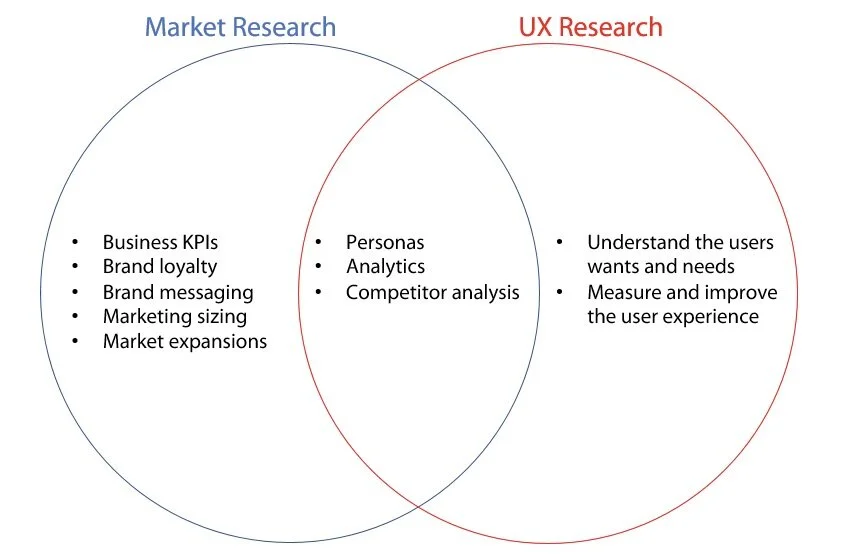
Is this Marketing or UX Research?
The line between marketing research and UX research can become blurred. UX designers typically need to have an established user market to apply their expertise effectively. At times, my team and I found ourselves questioning if we were doing marketing research or UX research.
We focused on finding the user, staying narrow and deep, and understanding the ”why” behind user behaviors.
My team and I had a conversation with the stakeholders and agreed upon the primary user in their market.
Gathering Data from the Users
Now we were finally in a position to conduct research interviews and release a survey to gather both qualitative and quantitative data. We selected participants for being millennials (plus or minus 2 years) that had colored in adult coloring books. The research found that users:
1. use coloring as a coping mechanism for stress
2. are comfortable with social media apps
3. like the ability to manipulate their images
4. would prefer a mobile app over a web design
Must-Should-Could-Won’t
As a team we collaborated our ideas into a “MoSCoW” chart for the Minimum Viable Product. It helped us focus our energy into what was important throughout the rest of the design. We took the following items into consideration:
1. Industry standards identified in our competitive analysis
2. Desired components identified by the stakeholders
3. Needs and goals of Charlotte, our user persona
4. Constraints of the the project (time, technology, and budget)
-
Research Interviews & Concept Testing
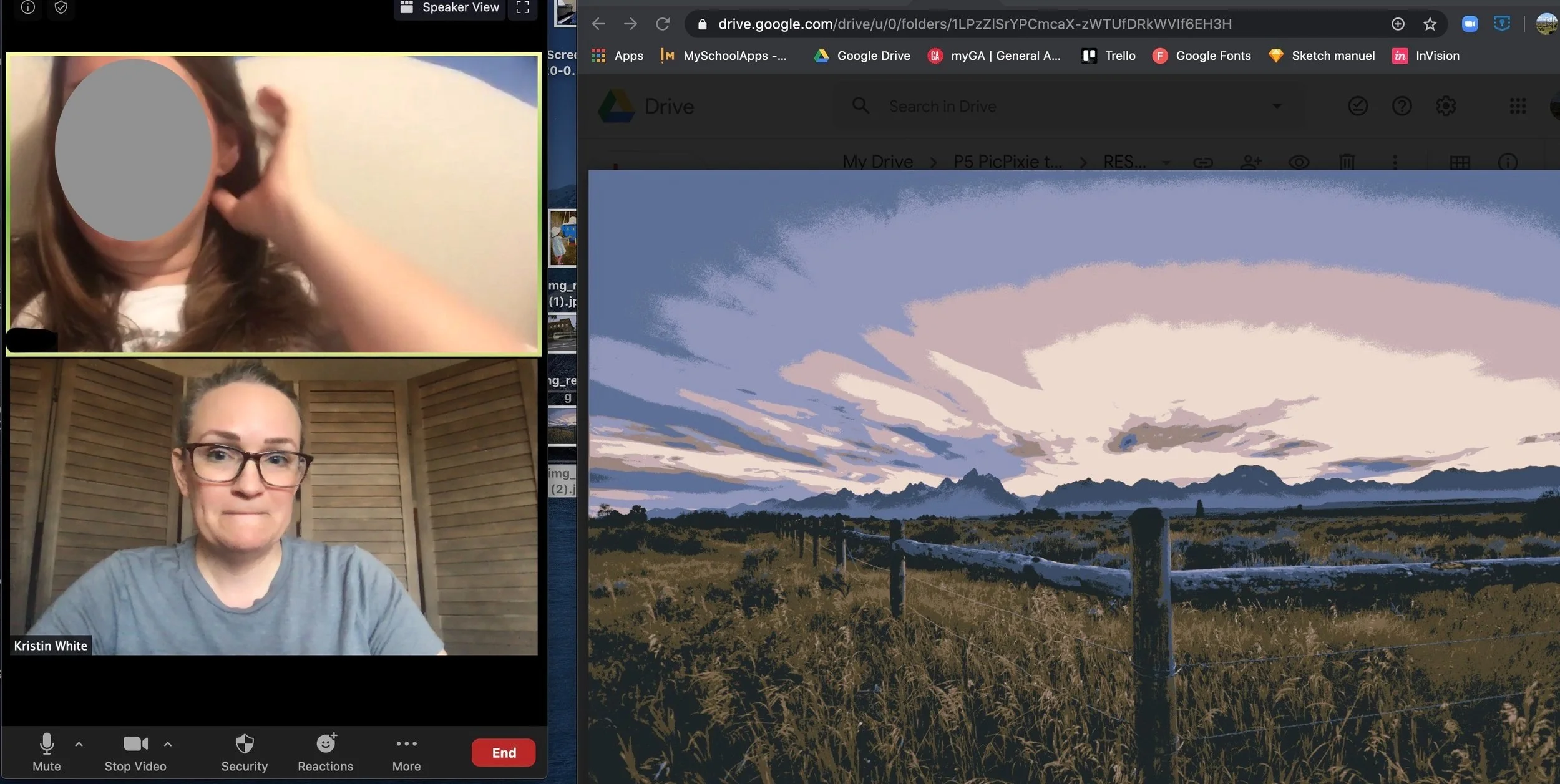
(Apparently I didn’t make sure I was smiling while taking this screenshot.) When research interviews were conducted, we used the opportunity to do concept testing with sample photos in each of the altered states. All interviews were done virtually over Zoom, and I transcribed as much feedback as I could.
-
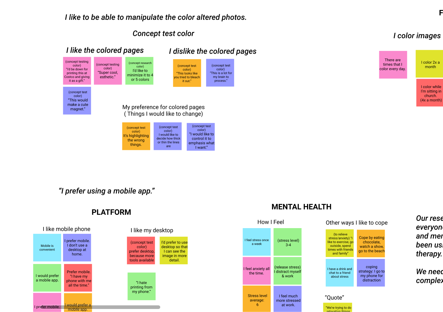
Affinity Mapping
All of the feedback from the stakeholder interviews, survey, and user research interviews were then put into an affinity map. We quickly found connections and common themes to guide the design.
The persona: Charlotte
The Problem
Charlotte needs a way to manipulate personalized photos so she can maintain motivation with her art therapy.
A Learning Curve
Surprisingly, this was a difficult stage for my team. We were doing all of this virtually, due to the quarantine, and at times it was difficult for us to understand each other. Marty, our design lead, was the one that started asking us to,
“show it!”
That became our new mantra, and we persisted through a very long design studio. We came up with some preliminary sketches that could then be made into a low-fidelity prototype.
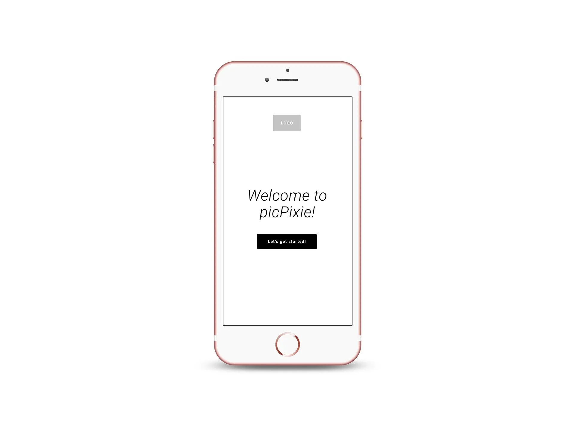
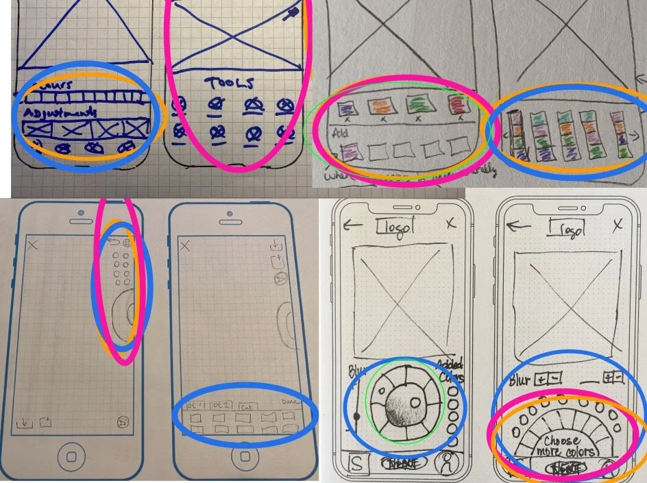
The low-fidelity landing page
Wireframes from the low-fidelity prototype, and the initial flow.
What Can This Algorithm Do?
During a stakeholder meeting, we learned that the algorithm renders the black-and-white sketch and color versions of the image at the same time. We did not know that initially, and so we had designed separate paths for each. That needed to be changed.
We were also informed that the algorithm does not allow us to edit and adjust the complexity in tandem. Those two options needed to be presented sequentially to avoid causing confusion and frustration.
The Users Run the Show
We scheduled out our 3 week sprint in such a way that we were able to do four rounds of usability testing: low-fi, mid-fi, and two hi-fi prototypes. Each round gave us insight into the users’ behavior and needs within the app.
A detailed description of each round of usability testing can be found in the final Research Report.
Wireframes from the mid-fidelity prototype
Wireframes from the high-fidelity prototype #1.
Usability Testing of the high-fidelity prototype.
Wireframes from the hi-fi prototype #2…
conversational prompts and a short “tutorial” were added
The Results
High-Fidelity Prototype
(Enter “full screen mode” by clicking on the black screen and then clicking the top right icon.)
Recommendations
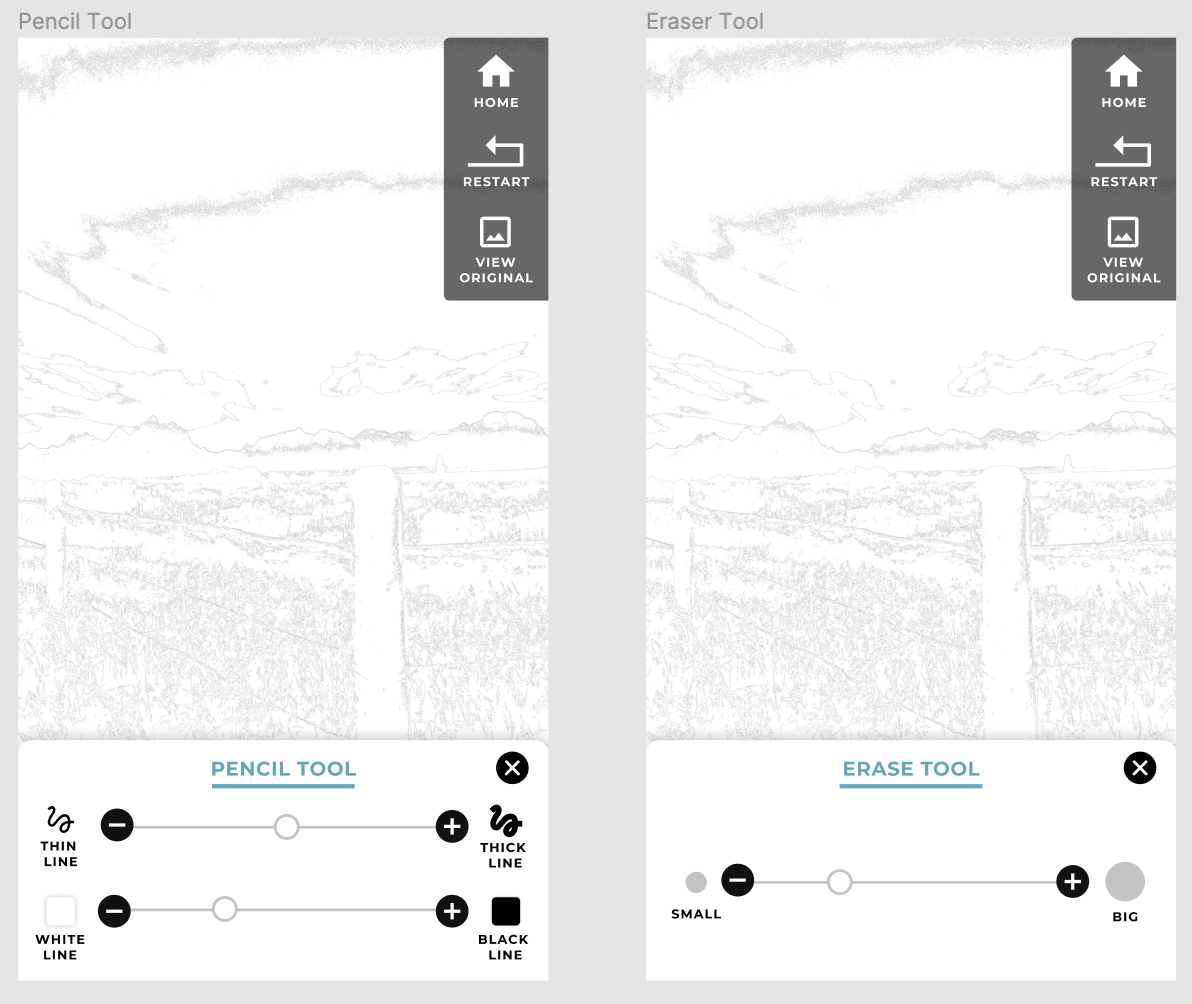
Test the pencil and eraser tools - Late in the game, the stakeholders expressed a desire for pencil and eraser tools. We did not have time to test them, but we provided some wireframes for them to have as a reference.
Take out the “view original” icon and change it to a press and hold interaction
Continue to experiment with their algorithm to see if it can create more defined areas and thicker lines
Seek out professional marketing consultation to further define the brand, business plan and marketing groups